

Ever wondered what makes a website layout so mesmerizing? Web design is evolving faster than your favorite TV series plot twists! Every day, people eagerly search for new webpage designs, keeping up with trends and updates. Why? Because a great layout isn’t just about looks-it’s about how effortlessly it guides you to what you need.
Think about it: when was the last time you clicked away from a poorly designed website? Probably too many times to count. The design can make or break a user’s experience, whether it’s clean and modern or a total eyesore.
Let’s see what’s the secret sauce behind creating outstanding layouts. Plus, you’ll see detailed examples that could inspire your next masterpiece. Keep scrolling-we’re just getting started!
11 Common Types of Website Layouts
Choosing a website layout might seem tricky at first, but it doesn’t have to be! Let’s break down the most popular ones, so you can find what works for your site. From eye-catching designs to layouts that scream functionality, here’s a closer look:
The right layout not only enhances your website’s appeal but also improves navigation and user experience. It ensures that visitors can quickly find what they’re looking for without frustration. Whether you’re showcasing a portfolio, selling products, or running a blog, there’s a perfect layout for every need. Let’s explore the options!
1. Z-Pattern Layout
The Z-pattern in web design is a visual layout pattern that guides the viewer’s eye along a specific path on a webpage. It’s based on how people typically scan content, especially on simpler pages with minimal text. Here’s how it works:
- Start at the Top Left: The viewer’s eye begins at the top left, where they often see the logo or main headline.
- Move Horizontally to the Top Right: The eye moves across to the top-right corner, where navigation menus or a call-to-action (like a signup button) might be placed.
- Diagonal Descent to the Bottom Left: After scanning the top, the eye naturally drops diagonally to the bottom-left area, engaging with secondary content or visuals.
- Horizontal Sweep to the Bottom Right: The eye finishes by moving to the bottom-right, which is an excellent spot for another call-to-action, contact info, or closing message.
When to Use It
The Z-pattern works best for simple, minimalistic designs, like:
- Landing pages
- Basic homepages
- Pages with minimal text but strong visuals or CTAs
It’s an excellent choice for guiding users through a natural flow without overwhelming them with content.
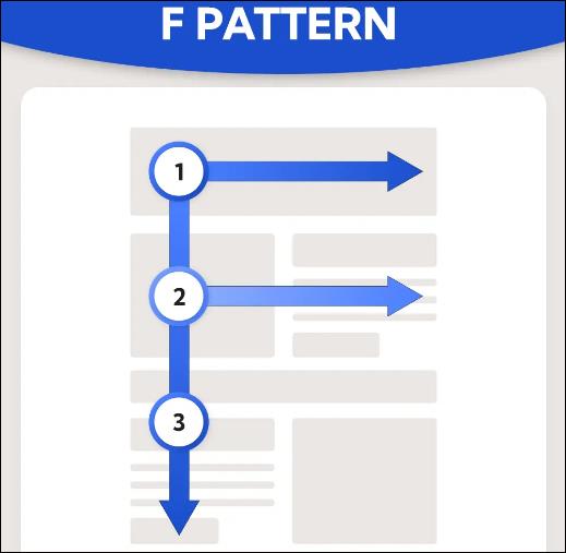
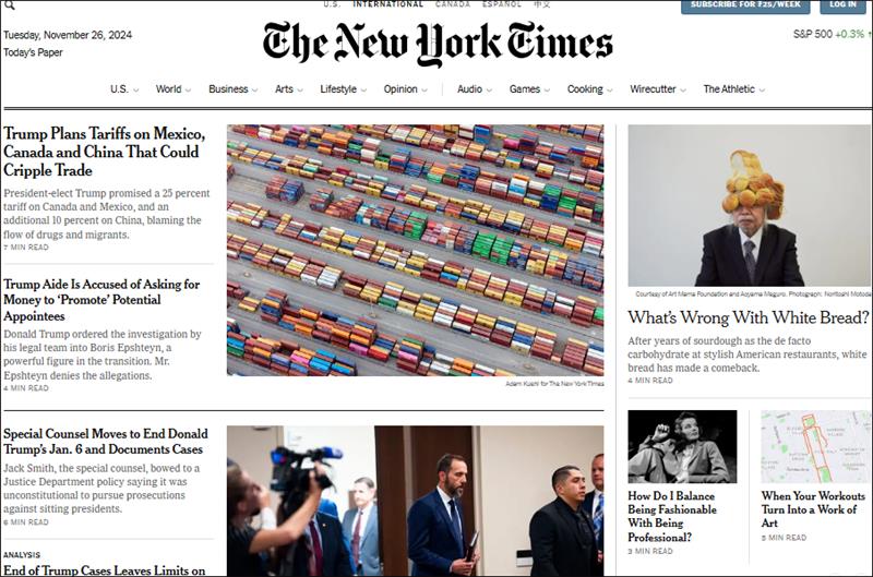
2. F-Pattern Layout
The F-pattern layout is designed to align with how people naturally scan text-heavy pages. It’s based on the way users read: focusing on the top of the page, skimming horizontally, and then moving vertically down the left side. This layout is perfect for content-rich websites where reading is the main activity. Here’s how it works:
- Start at the Top Left: Just like the Z-pattern, the F-pattern begins at the top left, where the user typically focuses on the headline or the most important information.
- Move Horizontally Across the Top: The viewer’s eyes move across the top horizontally, picking up key details like subheadings or important links.
- Vertical Scan Down the Left: The eyes then drop to the left side of the page, scanning further down for additional headlines or important content.
- Less Focus on the Right: The right side of the page gets less attention, so place secondary information or less critical content there.
When to Use It
The F-pattern layout is ideal for websites that prioritize text and need users to scan information quickly. Here’s where it excels:
- Blogs: It helps users quickly find articles or important subheadings.
- News Websites: Perfect for long-form content where users are skimming for key points.
- Content-Rich Sites: Any site where large amounts of text need to be organized efficiently.
This layout is perfect for ensuring your content is easily digestible and helps users quickly locate what they’re looking for, making it a go-to for websites with a lot of reading material.
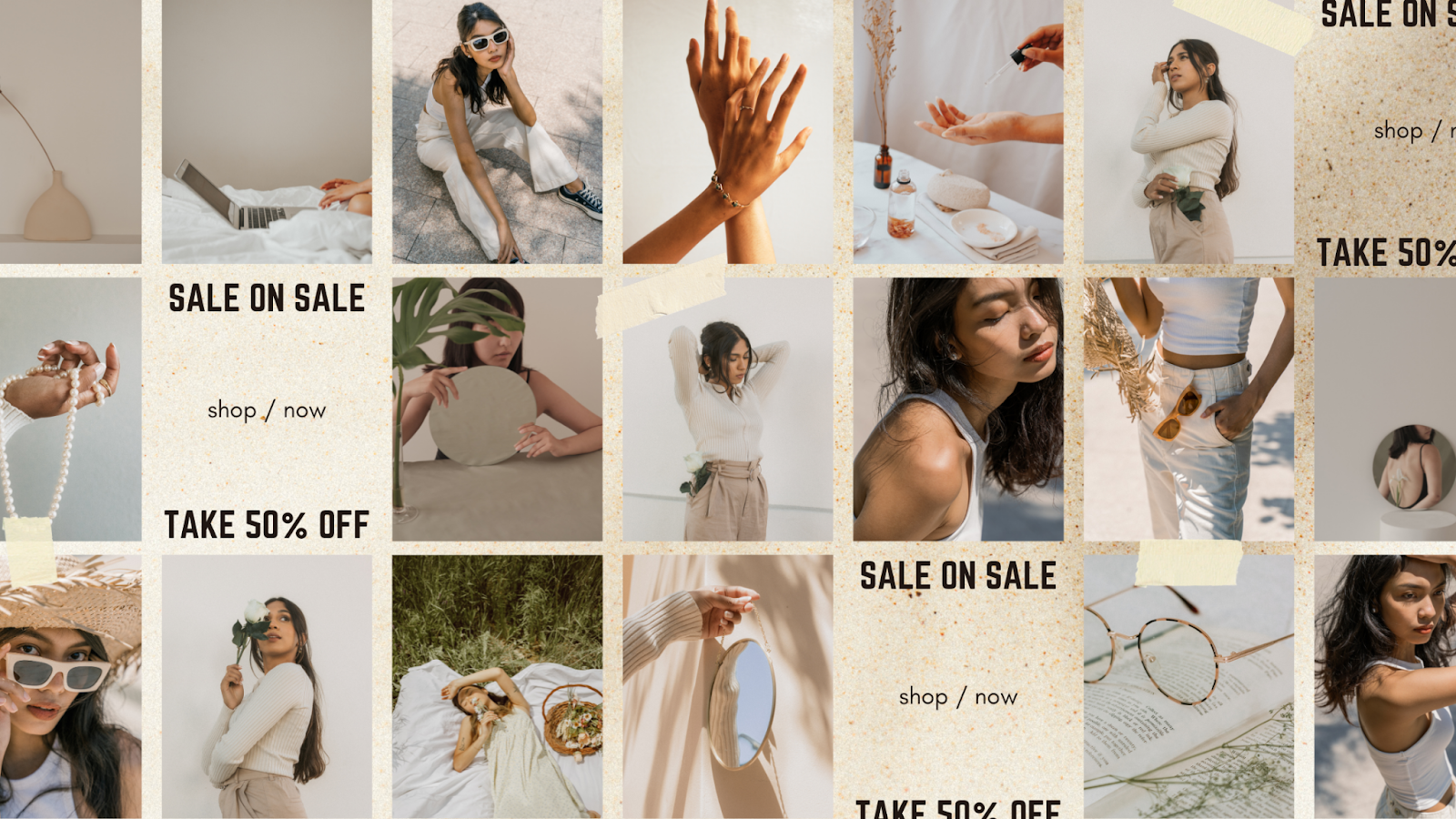
3. Magazine Layout
The magazine layout is all about showcasing diverse content in an organized yet visually engaging way. This layout mirrors the design of a traditional magazine, featuring large images, bold headlines, and well-structured sections. It’s perfect for websites that want to create a visually dynamic, professional appearance without overwhelming the viewer. Here’s how it works:
- Large Visuals at the Top: Similar to a magazine cover, this layout often places large images or featured content at the top to capture attention immediately.
- Bold Headlines: Prominent headings or subheadings are used throughout the page to guide the reader through various sections, just like flipping through the pages of a magazine.
- Multiple Columns and Sections: Content is broken up into multiple columns, which makes the layout feel spacious and easy to digest. It often includes sections for news, articles, or multimedia, providing variety.
- Well-Placed Call-to-Actions (CTAs): CTAs like “Read More” or “Subscribe” are placed strategically within the content to keep the user engaged without disrupting the flow of the page.
When to Use It
The magazine layout is perfect for content-heavy websites that need to look polished and organized. Here’s where it works best:
- News Websites: Display a mix of articles, breaking news, and features in an easy-to-navigate format.
- Media and Magazine Sites: Ideal for online magazines, lifestyle blogs, or sites that focus on entertainment, fashion, or lifestyle topics.
- Creative Portfolios: Showcase multiple projects or works in a clean, organized way that still allows for creativity and expression.
This layout is great for offering a visually rich experience, making it a popular choice for content-driven websites that need both organization and style.
4. Grid Layout
The grid layout is all about structure and balance. It divides the page into uniform columns and rows, creating a clean, orderly look. This layout is perfect for sites that need to display lots of content in a way that feels visually harmonious. The key here is symmetry-everything has its place, and it’s easy for users to navigate through. Here’s how it works:
- Uniform Columns and Rows: The page is split into equal-sized sections (like a table or a chessboard), where each content block is aligned perfectly.
- Content Blocks: Images, text, and other elements are contained within grid blocks, creating a neat and organized presentation.
- Consistency Across the Page: Every section follows the same pattern, making it easy for users to scan and find what they’re looking for.
- Responsive Design: The grid layout is highly adaptable, ensuring that content looks great on any screen size, whether desktop or mobile.
When to Use It
The grid layout shines when content needs to be displayed clearly and efficiently without overwhelming the viewer. Here’s where it’s most effective:
- E-commerce Websites: Display products in uniform rows and columns, making it easy for users to browse items.
- Portfolios: Showcase creative works (like photography, design, or art) in an organized, visually appealing way.
- Online Galleries: Perfect for image-heavy sites where content needs to be displayed in an easy-to-navigate format.
This layout is ideal for sites with a large amount of content that still need to maintain a polished and organized look. Whether you’re selling products or displaying artwork, the grid layout keeps everything in place, creating a visually pleasing and functional user experience.
5. Modular Layout
The modular layout is similar to the grid layout but with more flexibility. It divides the page into distinct, independent content blocks, or “modules,” that can be arranged in various ways. Each module can hold different types of content-text, images, videos, or interactive elements-allowing for greater customization. Here’s how it works:
- Independent Content Blocks: Each module is self-contained, meaning it can house anything from an image, a block of text, or even a call-to-action (CTA).
- Flexible Layout: Unlike a grid, the modules can vary in size, which gives the design more flexibility. Some sections may be larger (like a featured image), while others may be smaller (like a testimonial).
- Customizable Design: You can rearrange or add new modules as needed, which makes this layout perfect for websites that evolve and update regularly.
- Clean and Organized: While each block is independent, they work together to create a cohesive and tidy design, offering a modern and user-friendly experience.
When to Use It
The modular layout is ideal for dynamic websites that require flexibility and adaptability. Here’s where it works best:
- News and Media Sites: Display a variety of content (articles, images, videos, etc.) in neatly organized blocks that can be easily updated or rearranged.
- Product Listings: Great for showcasing multiple products or services in different modules, allowing for easy categorization and updates.
- Creative Websites: Perfect for portfolios or agencies that need to display diverse types of content (projects, testimonials, services) without cluttering the page.
This layout is perfect for websites that need to be flexible and modular, giving you the freedom to add, update, or change content on the fly without disrupting the entire design. It’s perfect for sites that are constantly evolving or that require a clean, organized structure.
6. Single-Column Layout
The single-column layout is the ultimate minimalist design. It organizes all your content into one vertical column, simplifying the user experience by focusing on one piece of information at a time. This layout eliminates distractions, making it perfect for websites that want to keep things straightforward and clean. Here’s how it works:
- Vertical Flow: All content is stacked in a single column, with each section leading to the next in a clear, uninterrupted flow.
- Focused Content: This layout encourages users to engage with the content as they scroll down the page, without sidebars or multiple columns to divert their attention.
- Ideal for Mobile: Since it’s designed with a single column, this layout adapts perfectly to mobile devices, offering a seamless experience on any screen size.
- Simple Navigation: With fewer distractions, users can easily navigate through the site, reading through content in a natural, linear progression.
When to Use It
The single-column layout works best for sites that prioritize simplicity and easy readability. Here’s where it excels:
- Blogs and Articles: Perfect for displaying long-form content where users can scroll through without getting distracted by other sections.
- Landing Pages: Great for focusing on one key message, such as a product or service offering, without overwhelming the visitor.
- Minimalist Websites: Ideal for portfolios or personal websites where you want to let the content speak for itself without extra visual clutter.
This layout is perfect when you want to keep things clean and easy to navigate. It’s great for content-driven sites that need to provide a seamless, distraction-free experience for users, especially on mobile devices.
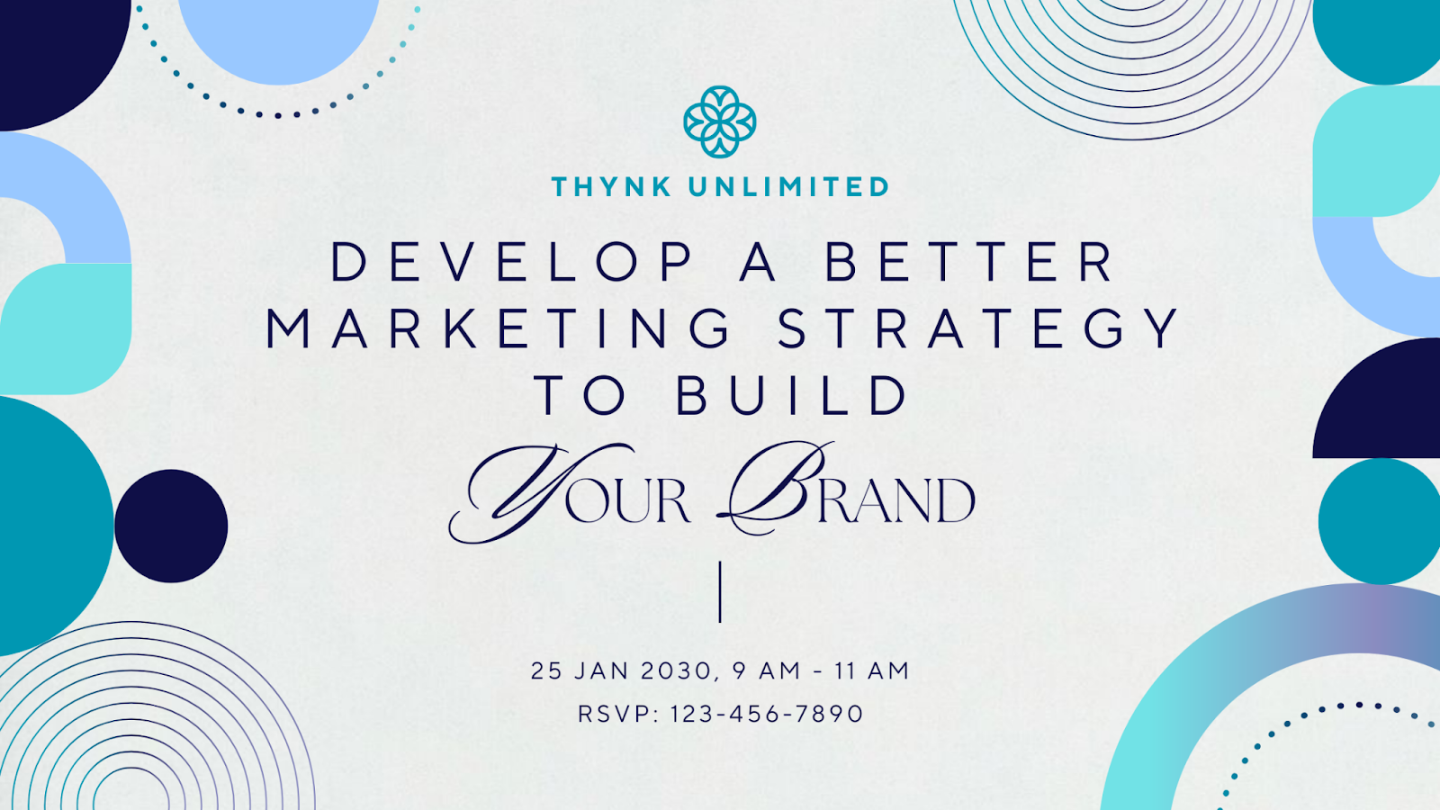
7. Content-Focused Layout
The content-focused layout is all about putting your content front and center. This layout is designed to ensure that the user’s attention is solely on the material you want them to engage with, whether it’s text, images, or videos. It strips away unnecessary distractions and places emphasis on the content itself. Here’s how it works:
- Minimalist Design: The layout uses simple design elements, letting the content shine without excessive graphics or decorations.
- Clear Hierarchy: Key content is prioritized through visual hierarchy, using larger fonts, bold headings, and strategic placement to draw attention to the most important parts of the page.
- Strategic Use of White Space: Adequate white space is used around content to prevent visual clutter and give each element room to breathe, improving readability and focus.
- No Unnecessary Elements: There are no sidebars or irrelevant features, just the essential content arranged in a clean, clear manner.
When to Use It
The content-focused layout works wonders for websites where content is the star. Here’s where it’s most effective:
- Blogs and Articles: Perfect for sites that provide long-form content or stories, allowing users to focus purely on reading without distraction.
- Educational Websites: Ideal for e-learning platforms, where the content is the main attraction and needs to be easily consumed.
- Media Websites: Great for news or magazine-style sites where the content needs to be accessible and easy to navigate.
This layout is all about making sure the user’s attention is on your message. It’s perfect for content-driven websites that need to provide an uninterrupted and engaging reading or viewing experience.
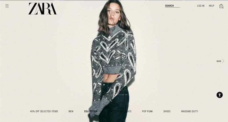
8. Full-Screen Layout
The full-screen layout is a bold, immersive design that takes advantage of the entire screen space. It’s perfect for creating a visually striking experience where the content (usually images or videos) fills up the entire screen. This layout grabs the user’s attention right away and keeps it focused on the message you want to deliver. Here’s how it works:
- Maximized Visual Impact: Large, high-quality images or videos dominate the background, helping to create an immersive experience.
- Minimal Text: Text is usually kept to a minimum, focusing more on visuals to convey the message. When used, the text is often overlayed on the screen in large, bold fonts.
- Simple Navigation: Navigation tends to be minimal, with sleek buttons or scroll-based navigation to maintain the focus on visuals.
- Responsive Design: The layout adapts well to different screen sizes, ensuring that the visual experience looks just as striking on mobile or desktop.
When to Use It
The full-screen layout is perfect for websites that want to make an instant visual impact. Here’s when it shines:
- Portfolio Websites: Great for photographers, designers, and artists who want to showcase their work with maximum visual impact.
- Landing Pages: Ideal for promoting a single product, service, or campaign, where the focus is on creating excitement or curiosity with visuals.
- Brand Websites: Perfect for brands that want to convey a strong visual identity and create a memorable experience for their audience.
This layout is all about going big and bold. It’s perfect for anyone who wants to make a powerful visual statement and immerse users in their content right from the start.
9. Hero Layout
The hero layout is designed to immediately capture attention with a large, eye-catching element (usually an image, video, or graphic) placed at the top of the page. This “hero section” serves as the focal point of the page, with supporting content following below. It’s all about creating a strong first impression and encouraging users to take action. Here’s how it works:
- Large Hero Image or Video: The hero section is typically a full-width image or video that fills the screen, giving users an immediate visual experience.
- Clear Call-to-Action (CTA): Often, there’s a prominent CTA button or message right in the hero section, encouraging users to act immediately (e.g., “Shop Now,” “Learn More,” “Sign Up”).
- Minimal Text: The text in the hero section is usually brief but impactful-often a headline or tagline that introduces the website’s main purpose.
- Scrolling Down to Content: After the hero section, the rest of the content follows, giving a natural flow to the page that invites further engagement.
When to Use It
The hero layout works great when you want to highlight a key message or action right off the bat. Here’s when it’s most effective:
- Landing Pages: Perfect for showcasing a product, service, or campaign with a strong visual and a clear CTA.
- Product or Event Promotion: Ideal for websites that need to promote something specific, like a new product or an upcoming event.
- Branding Websites: Great for companies that want to make a bold statement with their visual identity, reinforcing their brand image from the get-go.
This layout is all about grabbing attention instantly with a powerful visual and compelling message. It’s perfect for creating an unforgettable first impression that keeps users engaged.
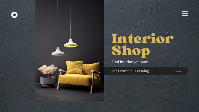
10. Split-Screen Layout
The split-screen layout divides the webpage into two distinct sections, usually with a vertical line down the center. Each side can feature different content, such as text, images, or videos, offering a dynamic, balanced design. This layout is great for websites that want to present two equally important pieces of content at the same time, allowing users to make a choice or compare information quickly. Here’s how it works:
- Two Equal Sections: The screen is divided into two sections (left and right), each with its own content. This can be a combination of visuals and text, or two distinct elements like a video on one side and a call-to-action on the other.
- Contrasting Elements: The two sides often feature contrasting colors or visuals to create a visual break and draw the viewer’s attention to both areas equally.
- Interactive Design: Often, the split screen layout encourages interaction, with one side prompting the user to take action (e.g., a button, form, or CTA) while the other informs them about a service or product.
- Balanced User Experience: The layout provides symmetry and balance, helping to organize content in an easily digestible way without overwhelming the viewer.
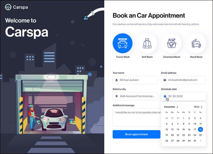
When to Use It
The split-screen layout is ideal for websites that need to present two sides of a story or two major actions at once. Here’s when it’s most effective:
- Product Comparisons: Perfect for showcasing two products side by side, allowing users to compare features or benefits directly.
- Landing Pages with Multiple Goals: When you want to offer two choices to users, such as “Sign Up” vs. “Learn More,” or “Free Trial” vs. “See Pricing.”
- Creative Portfolios or Agencies: Great for creative professionals or agencies who want to showcase two different styles or services at once, giving users the option to choose.
This layout is perfect when you want to emphasize two important elements equally, helping users make decisions quickly and easily. It offers a balanced, engaging experience that’s both functional and visually appealing.
11. Asymmetrical Layout
The asymmetrical layout breaks away from the traditional grid and embraces a more dynamic, unconventional design. As the name suggests, the elements are not symmetrically balanced, creating an intriguing, off-kilter look that draws attention. This layout is perfect for websites that want to stand out and create a unique, artistic vibe. Here’s how it works:
- Unbalanced Design: Unlike a grid or modular layout, the elements on the page are intentionally placed in an asymmetrical manner, often with larger sections on one side and smaller ones on the other.
- Dynamic Flow: The design creates a sense of movement, leading the user’s eye across the page in unexpected ways. It feels fresh and engaging, guiding the user to explore more.
- Creative Use of Space: Asymmetry allows for the creative use of white space, making the page feel open and airy while still guiding users’ attention to important elements.
- Bold, Artistic Aesthetic: This layout is often used in creative industries, where the design is part of the brand’s identity. It’s modern, edgy, and visually striking.
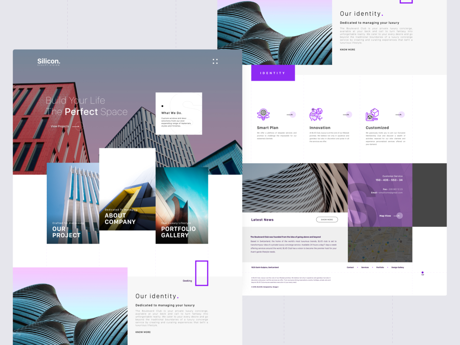
When to Use It
The asymmetrical layout is ideal for websites that want to break free from traditional design conventions and make a bold statement. Here’s when it works best:
- Creative Portfolios: Perfect for designers, photographers, and artists who want to showcase their work in a unique, artistic way that reflects their creativity.
- Branding Websites: Great for brands that want to stand out with a memorable, unconventional design that captures attention and leaves a lasting impression.
- Modern Lifestyle Websites: Ideal for fashion, architecture, or tech companies that want to convey a sense of innovation and cutting-edge style.
This layout is all about making a statement and creating a memorable experience. It’s perfect for creative professionals and brands looking to stand out and express their unique identity through their website design.
Picking the Best Website Layout for Your Site
Choosing the right website layout can feel like a puzzle, but don’t worry-it’s easier than it sounds! A solid layout helps organize everything on your page, making it look neat and inviting. It ensures visitors know exactly where to go, which makes their experience smoother and more enjoyable.
The key here is figuring out what your website needs. Are you showing off a portfolio, running an online store, or sharing helpful info? Your layout should reflect the vibe and goals of your site. If you’re building on WordPress, the platform’s flexibility with affordable WordPress pricing makes it easy to find a theme or plugin that aligns with your needs and budget. A good layout not only makes your content pop but also keeps visitors coming back for more.
Website Layout vs. Website Structure
First things first, let’s clear up the difference between website layout and website structure. While these terms are often used interchangeably, they actually focus on different aspects of web design. The layout is all about how your website looks-its visual elements and arrangement-while structure is more about how the site functions and how content is organized. Think of layout as the skin of the website, and structure as its skeleton. Let’s see how we can break them down into simple ideas:
Website Layout (Looks and Design)
- Focuses on visual elements like colors, fonts, images, and the overall style.
- Deals with how content is arranged on the page-whether it’s a grid, single column, or modular setup.
- Includes the placement of elements like navigation menus, headers, footers, buttons, and images.
- A good layout enhances user experience by making the site visually appealing and easy to navigate.
Website Structure (Functionality and Organization)
- Refers to how the content is organized across your entire site, including how pages are linked together.
- Deals with navigation, internal linking, categories, and subcategories of content.
- Ensures that search engines can crawl and index your site effectively, which impacts SEO.
- A good structure helps visitors find what they’re looking for easily, supporting smooth functionality and user interaction.
In short, the layout grabs attention and makes your site look good, while the structure makes sure everything works seamlessly and is easy to find. They’re both crucial for creating a user-friendly website, so making sure they complement each other is key!
What Are Your Website Layout Goals?
Before jumping into designing your website, it’s important to ask yourself: what do you want your visitors to do when they land on your page? Your website layout should be designed around your specific goals to create an effective user experience. Whether you’re trying to sell, inform, or entertain, your layout needs to guide visitors toward your main objective.
Ultimately, your layout should be a reflection of your website’s purpose. Aligning the design with your core goal ensures a smoother experience for your visitors and a higher chance of achieving what you set out to do.
Consider the Website Type
When choosing a website layout, it’s crucial to consider the type of website you’re building. Different websites have different needs, and not all layouts will work for every purpose. For example, a blog typically benefits from a content-focused layout that highlights articles and keeps readers engaged. On the other hand, an e-commerce site thrives on a grid layout that allows customers to easily browse products and make purchases. Creative portfolios, landing pages, and business websites all require layouts that support their specific goals-whether that’s showcasing work, driving conversions, or presenting professional services.
In short, the key to picking the right layout is understanding your website’s purpose. Aligning the design with your site’s goals ensures a smoother user experience and helps achieve desired results. A carefully chosen layout enhances functionality and guides visitors to take the actions you want them to, whether it’s reading content, shopping, or learning more about your services.
Research Matters
When picking the right layout, don’t skip the research part! Check out your competitors’ websites and see what’s working for them. Explore how they organize their content, display products, or guide users around their pages. This gives you a solid idea of what people in your industry like and what’s already proven to work. You can take what you like from those designs and give them your own twist, making sure your website stands out but still follows what’s popular.
It’s also worth looking at design trends that are popping up across different industries. Whether it’s a sleek, minimalist look or more interactive, eye-catching features, trends can help spark ideas. Many websites also rely on customizable WordPress themes to align their design with industry standards while saving time. But remember, don’t just follow trends for the sake of it-make sure what you choose fits your brand and goals. By mixing in some current trends and staying true to your unique style, you’ll end up with a layout that’s fresh, functional, and totally you.

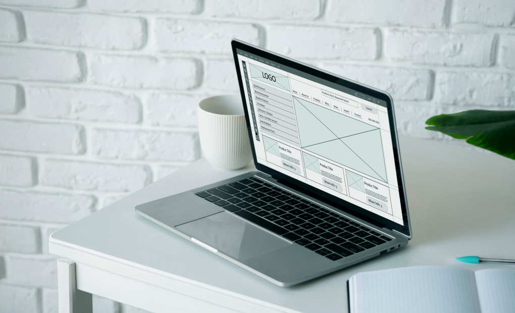
Creating a Website Layout Mockup
Before diving into the design process, it’s essential to start with a wireframe. This is the foundation of your website’s structure, giving you a clear outline of where all the important elements should go. Think of it like the skeleton of your website-it doesn’t have any styling yet, but it gives you a sense of how everything will fit together. Once you have your wireframe, it’s much easier to make design decisions and stay focused on functionality.
Here’s a quick breakdown of why wireframing is so important and what it helps with:
- Clarifies Structure
A wireframe helps you visualize the layout’s structure and positioning of key elements, like navigation menus, headers, and content sections. This makes it easier to plan the user flow and decide what should go where. - Improves Design Process
With a wireframe in place, you can quickly test different ideas without worrying about color schemes or fonts just yet. You can focus solely on how the layout functions, which saves time when you start working on the final design. - Prevents Mistakes
Wireframing helps identify potential issues early on. Maybe a section feels too crowded or a call-to-action button is too small. You can fix these problems before jumping into the more detailed design phase. - Aligns Teams
Whether you’re working solo or with a team, a wireframe provides a reference point that everyone can agree on. Designers, developers, and content creators can all look at the wireframe to make sure everyone’s on the same page.
Once your wireframe is ready and you’re happy with how the layout works, you can start building out the more detailed mockup. This is where you bring your creative ideas to life, adding colors, fonts, images, and more. The mockup helps refine the look and feel of your website, ensuring everything comes together seamlessly.
Tools like Figma or Sketch make this step easy. Lay out where elements will go, adjust as needed, and create a solid foundation. These tools also allow for real-time collaboration, so you can get feedback and make changes instantly, improving the process. With features like reusable components and interactive prototypes, you can visualize how users will interact with your site, making it easier to create a design that works both visually and functionally.
Why Choosing the Perfect Layout is Crucial!
Still feeling overwhelmed? Don’t worry! Picking the perfect layout is easier with a bit of guidance. Whether you’re running a blog or launching an e-commerce store, choosing the right design ensures better engagement and conversions.
If you’re looking for expert help, Wpcaps has got you covered! From amazing WordPress themes to hassle-free website maintenance, we’ve got your back every step of the way. Plus, our affordable WordPress pricing makes professional designs totally within reach. Let us take care of the tricky stuff while you focus on growing your site!
Choosing the right layout doesn’t have to be overwhelming-just follow these tips, and you’ll have a site that stands out in no time!